In addition to being more engaging and boosting response rate, question that has icons as options is a great way to bring your brand into the survey. You can utilize your own graphics with the help of this guide or contact us for some custom-made icons! Send your inquiry and wishes on our Contact us page.
Creating the images
To look good, the icon images should have at least some transparency in them. Make sure to save images created as PNG, as that file type supports transparency and those can be uploaded to our tool’s media library.
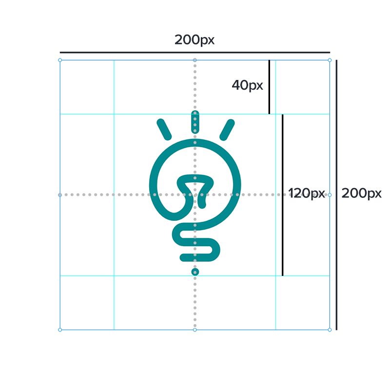
Recommended dimensions for the image files are 200 x 200 pixels when there is four options side by side. If you are planning to use fewer image options, the image dimensions should be increased.
There should be left some empty space around the icon itself. You and your brand can define how much empty space is needed. Icon images made in Surveypal follow these measures:
- Image dimensions: 200 x 200 pixels
- Icon height/width (whichever is bigger): 120 pixels
- Empty space around between the icon are and image borders: 40 pixels
Also, the icon looks best when it is vertically and horizontally centered to the canvas.
Creating the image selection element
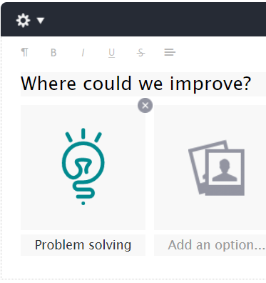
On the Build view, add Image selection element to your survey
Add the images prepared before to the element
Under the images, add descriptive texts for the images
Edit the element’s settings to meet your needs:
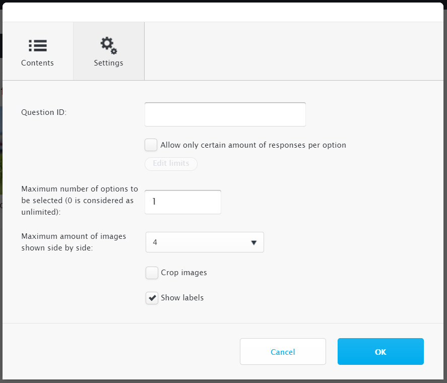
- If more than one option should be able to be selected, change Maximum number of options to be selected value
- If you have different amount of options, you can change the Maximum amount of images shown side by side to decide how many images will be shown on the same row
- If the images you are using are not square-shaped, Crop images should be deselected
- Show labels is recommended to leave checked unless you are absolute sure the icons don’t need any explanation or have the descriptions in them
- Additionally, from the element’s gear menu you can choose if survey should change page when an option is selected. In questions where only one option can be selected the answering experience can be made smoother by choosing this setting
On the Design view, add this CSS to the custom CSS style field:
.element[data-elementname="p0e1"].eimageselection .option.selected { background-color: rgba(0, 0, 0, 0); }
.element[data-elementname="p0e1"].eimageselection .option .image { background-color: #e1e2e3; border-radius: 0px; }
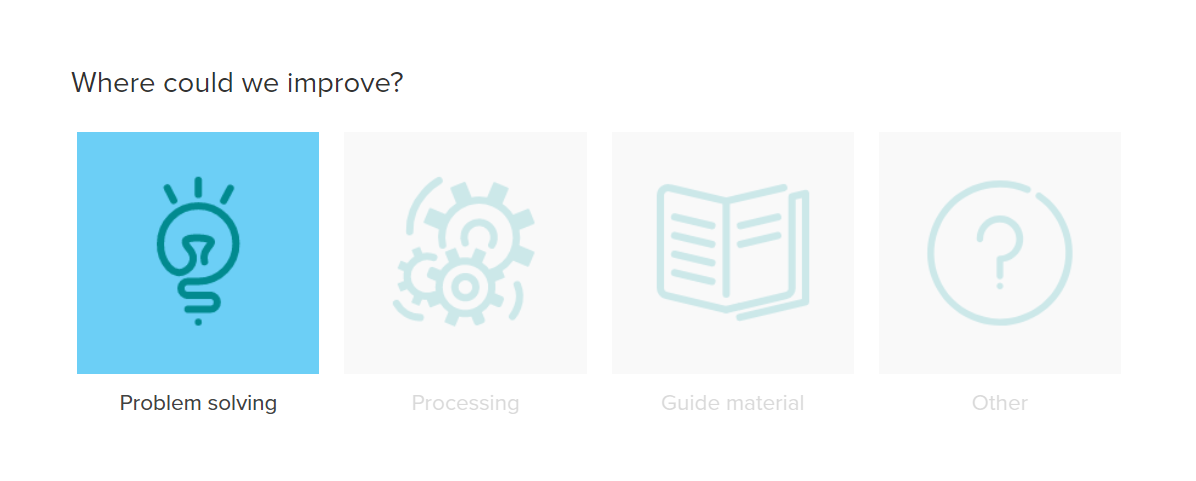
.element[data-elementname="p0e1"].eimageselection .option.selected .image { background-color: #6CCFF6; }
Modify the code to fit your element:
- Change the element code “p0e1” to your element’s code (more information about element codes) in all three selectors in the code
- Modify the unselected option images’ background color by changing the color value after .eimageselection .option .image (value in this example is #e1e2e3)
- Modify the highlight color of selected image(s) by changing the color value after .eimageselection .option.selected .image (value in this example is #6CCFF6)
- The background shape can also be varied from square to more round by varying the border-radius value after .eimageselection .option .image
Last, make sure image selection element’s settings and layout are correct by checking the element from Preview-view